SoraNews24 —Japan News—
Bringing you yesterday's news from Japan and Asia, today.
-
TOP
» Japan
-
» Just what the heck is the Tokyo Olympics symbol supposed to be?
Featured
- Weird
- Studio Ghibli
- Jobs
Just what the heck is the Tokyo Olympics symbol supposed to be?
 Casey Baseel Jul 27, 2015
- Tweet
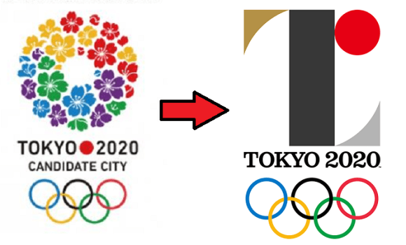
Back before Tokyo was selected as the host of the 2020 Olympics and Paralympics, the organizing committee started putting up posters around the capital touting its status as a candidate city. The logo was a circle of cherry blossoms using four of the five colors of the Olympic rings (with purple substituting for black).
You could say it was a clichéd choice, but on the other hand, it’d be hard to come up with a symbol more instantly associated with Japan than the sakura. Mt. Fuji, maybe, but it isn’t in Tokyo, and a piece of sushi would look more like a promotion for a restaurant than a sporting competition.
But perhaps because the cherry blossoms bloom in spring and Tokyo is hosting the Summer Games, the sakura ring isn’t going to be used for the actual 2020 Olympics and Paralympics themselves. Instead, Japan’s Olympic Committee recently came up with two new logos. In the eyes of some people in Japan, however, even though the designs embody a deep message, they’re lacking in aesthetic sense.
At first glance, it’s sort of hard to tell what the Olympic logo is trying to be. Why is there a gigantic “I” in the middle of a design for an event for which creating connections with other cultures is a key goal? Or is that supposed to be a lowercase “r,” with a two-tone red/black color scheme?
Actually, it’s a capital “T,” as in “Tokyo…”
…and also as in “team,” and “tomorrow,” which are being touted as themes for the Games in this video introducing the design.
The red circle is the same one that appears on the Japanese flag, representing the sun. The gold and silver accents are seemingly references for the Olympic medals of the same color (apparently there’s no room for third place in this logo).
But why black? Because that’s the shade you get after mixing every color together, the Olympic Committee says on its website.
There’s a similarly admirable sentiment behind the Paralympics logo.
Although it uses the same lines, the Paralympics’ symbol’s different colors result in a pair of black lines. Rotate them 90 degrees, and you get…
…an equal symbol, asserting the fundamental equality of all people.
Still, reactions have been mixed online in Japan.
“I can’t tell what they’re supposed to be!”
“I honestly like them.”
“In a word, they’re uncool.”
“I think they look good, because they’re sort of like a J-League soccer logo.”
“Doesn’t need the lame-looking part from the Japanese flag.”
“Should have gone with the one with the flowers.”
“All I’m seeing is the Zaku [one-eyed robot from Mobile Suit Gundam].”
Several commenters also expressed displeasure with how the red mark reminds them of the pickled plum in a cheap bento or rice ball, which is a common complaint among citizens of Japan regarding their country’s flag, as well.
▼ It’s still a less prominent motif than it was in 1964, however.
We doubt anyone would argue against either of the design’s core philosophes, but from a purely visual standpoint, it looks like a lot of people were hoping for something that was meaningful while also being more overtly pleasing to the eye. Still, given some of the other things the Japanese Olympic Committee has to deal with right now, maybe logo design isn’t its top priority.
Source: Jin
Top image: The Tokyo Organising Committee of the Olympic and Paralympic Games (1, 2) (edited by RocketNews24)
Insert images: The Tokyo Organising Committee of the Olympic and Paralympic Games, YouTube/TOKYO Organising Committee, Wikipedia/Magnus Manske (edited by RocketNews24)
Like this:
Like Loading…
- Japan
- (2020 Olympics • design • Olympics • Tokyo Olympics)
Related Stories
 Is there an adorably chubby bird hiding inside the Tokyo Olympics logo?
 Looks like it’s time to say good-bye, and maybe good riddance, to the 2020 Tokyo Olympics logo
 Tokyo Olympics and Paralympics mascot finalists unveiled【Pics & Video】
 Online auction market booming for posters with cancelled, possibly copied 2020 Olympics emblem
 2020 Tokyo Olympic torch relay to tour all 47 prefectures of Japan starting from Fukushima
- Trackbacks (1)
Trackbacks
-
Tokyo’s Olympic Logo Is Axed But The Internet Already Has Awesome Backups | Gizmodo Australia
[…] former logo left some fans cold in the first place, though. So the Twitterverse was already prepared to suggest plenty of […]
-
Trackback URL
Trending Today
- Ichiran releases an at-home counter kit that turns your desk into a ramen restaurant
- Starbucks Japan releases new Bearista glass tumbler that changes character with every drink
- Yesterday’s cooking oil powers 410,000 pink winter sakura lights along Tokyo’s Meguro River
- Akihabara restaurant with 1.7 million sushi bowl options will have us coming back again and again
- Tokyo police arrest the Ame-zing Spider-Man
- Cup Noodles go isekai in crossovers with three of Japan’s other favorite foods [Taste test]
- Ichiran Japan is giving away free 2027 desk calendars, and here’s how to get them
- Life-size Gundam head going on display in Osaka, hopefully will find permanent home
- Family Mart releases 47 convenience store socks and stickers, one for every prefecture in Japan
- KFC now sells takikomi gohan rice boxes in Japan, if you know where to look for them [Taste test]
-
Recent Posts
- Akihabara restaurant with 1.7 million sushi bowl options will have us coming back again and again
- Cup Noodles go isekai in crossovers with three of Japan’s other favorite foods [Taste test]
- Ichiran Japan is giving away free 2027 desk calendars, and here’s how to get them
- Yesterday’s cooking oil powers 410,000 pink winter sakura lights along Tokyo’s Meguro River
- Life-size Gundam head going on display in Osaka, hopefully will find permanent home
-
MOST POPULAR
- Today
- Weekly
- Monthly
- Yearly
Today
 Ichiran releases an at-home counter kit that turns your desk into a ramen restaurant
 Starbucks Japan releases new Bearista glass tumbler that changes character with every drink
 Yesterday’s cooking oil powers 410,000 pink winter sakura lights along Tokyo’s Meguro River
 Akihabara restaurant with 1.7 million sushi bowl options will have us coming back again and again
 Tokyo police arrest the Ame-zing Spider-Man
 Cup Noodles go isekai in crossovers with three of Japan’s other favorite foods [Taste test]
 Ichiran Japan is giving away free 2027 desk calendars, and here’s how to get them
 Life-size Gundam head going on display in Osaka, hopefully will find permanent home
 Family Mart releases 47 convenience store socks and stickers, one for every prefecture in Japan
 KFC now sells takikomi gohan rice boxes in Japan, if you know where to look for them [Taste test]
Weekly
- Ichiran releases an at-home counter kit that turns your desk into a ramen restaurant
 Tokyo cracks down on Airbnb-style rentals with new laws limiting operator days and more
 America’s first-ever permanent One Piece store is now open [Photos]
 Tokyo neighborhood adds new “smart trash cans” to deal with increasing amounts of tourist litter
 Two Tokyo neighborhoods to gather on bridge and shift their recognized border through tug-of-war
- Starbucks Japan releases new Bearista glass tumbler that changes character with every drink
 New Era celebrates three decades of Pokémon with new 30th anniversary cap line [Photos]
 Starbucks Japan reveals new Joyful Capsule gacha toy release date
 Pokémon card game’s expansion features art from Fist of the North Star creator
 Japanese hoodie for cat-loving gamers will keep you and your feline friend warm and fuzzy [Pics]
Monthly
 Pokémon Company announces first-ever permanent Pokémon store to open outside Asia
 Japan ends tax-free shopping system for foreign tourists, new refund request system now in effect
 Japan’s TeamLab digital art group is opening a permanent museum in America
 Beautiful Ghibli diorama kits lets you build anime characters’ homes inside yours [Photos]
- Family Mart releases 47 convenience store socks and stickers, one for every prefecture in Japan
- Ichiran releases an at-home counter kit that turns your desk into a ramen restaurant
 Chainsaw robots helping keep trains running safely in east Japan [Video]
 New Studio Ghibli anime gets extended run at the only cinema in Japan where it’s being shown
 Osaka’s famous Glico Running Man will be removed and replaced with a new-look sign
- Tokyo cracks down on Airbnb-style rentals with new laws limiting operator days and more
Yearly
 Japan announces sudden 400-percent increase in visa fees for foreigners entering the country
 Japan’s human washing machines will go on sale to general public, demos to be held in Tokyo
 Studio Ghibli has a new anime out, and there’s only one place in the world where you can see it
 Starbucks Japan releases new drinkware and goods for Valentine’s Day
 Starbucks Japan releases new sakura goods and drinkware for cherry blossom season 2026
 Japan’s newest Shinkansen has no seats…or passengers [Video]
 Tokyo subway installing new ticket gates that don’t accept payment through Suica or other IC cards
 Japanese ninja certification exam attracts 131 candidates from Japan and abroad
 Salomon releases Japan-exclusive Mt. Fuji hiking gear that doubles as an amazing souvenir
 Japan reportedly adding Japanese language skill requirement to most common foreigner work visa
-
RECOMMENDED STORIES
 Could the 2020 Tokyo Olympics logo possibly be plagiarized?
 Tokyo Olympics ceremony chief quits after suggesting Naomi Watanabe dress as an “Olympig”
 Tokyo Olympics opening ceremony preliminary ticket prices announced, wallets cry across Japan
 The 2020 Tokyo Olympics announces the winner of its adorable mascot election
 Official 2020 Tokyo Olympic logos possess a little secret you might not have noticed
 Japanese government reveals new hot spring symbol for foreign tourists ahead of Tokyo Olympics
 Tokyo Olympics to allow spectators, provided they “cheer quietly”
 Tokyo Olympics is looking for volunteers, may have a hard time finding them
 Tokyo Olympics will not allow spectators from overseas
 Tokyo Olympic committee comes up with clever way to let blind children help select Games’ mascots
 Olympic committee expands call for logo design submissions, children and office workers welcome
- Tokyo Olympics loses first participant as Canada withdraws from Games over coronavirus concerns
 Tokyo Olympics bans fans from posting videos of the Games on their social media accounts
 Tokyo Olympics organizers offer to pay volunteers 125 yen 【US$1.13】 an hour, critics unimpressed
 A look inside the Tokyo Media Centre for the 2020 Olympic and Paralympic Games
-
-
Categories
Categories Select Category Africa (33) Anime & Manga (193) Art (64) Australia (42) C America (9) C Asia (17) Canada (59) Cats (72) China (847) Culture (180) Cute (187) Entertainment (248) Europe (345) FN24 (1) Food & Drink (314) Games & Tech (167) Global (1,073) India (11) Internet (2,198) Italy (13) Japan (34,597) Korea (375) Lifestyle (76) Mexico (6) Music (12) N Asia (4) New Zealand (11) News (61) North Korea (72) Oceania (10) Russia (56) S America (33) S Asia (66) SE Asia (378) Space (2) Taiwan (203) UK (18) Uncategorized (19) USA (979) W Asia (25)
-
Archives
Archives Select Month November 2026 (66) October 2026 (144) September 2026 (156) August 2026 (174) July 2026 (197) June 2026 (174) May 2026 (138) April 2026 (142) March 2026 (150) February 2026 (124) January 2026 (138) December 2025 (136) November 2025 (136) October 2025 (151) September 2025 (154) August 2025 (143) July 2025 (158) June 2025 (165) May 2025 (162) April 2025 (181) March 2025 (157) February 2025 (127) January 2025 (139) December 2024 (148) November 2024 (149) October 2024 (153) September 2024 (154) August 2024 (158) July 2024 (156) June 2024 (150) May 2024 (166) April 2024 (150) March 2024 (157) February 2024 (169) January 2024 (159) December 2023 (165) November 2023 (166) October 2023 (166) September 2023 (173) August 2023 (183) July 2023 (171) June 2023 (180) May 2023 (158) April 2023 (152) March 2023 (167) February 2023 (160) January 2023 (171) December 2022 (175) November 2022 (176) October 2022 (179) September 2022 (191) August 2022 (202) July 2022 (193) June 2022 (178) May 2022 (178) April 2022 (181) March 2022 (212) February 2022 (199) January 2022 (224) December 2021 (230) November 2021 (214) October 2021 (215) September 2021 (238) August 2021 (225) July 2021 (207) June 2021 (218) May 2021 (209) April 2021 (206) March 2021 (225) February 2021 (209) January 2021 (224) December 2020 (225) November 2020 (224) October 2020 (231) September 2020 (238) August 2020 (227) July 2020 (220) June 2020 (209) May 2020 (215) April 2020 (238) March 2020 (235) February 2020 (222) January 2020 (233) December 2019 (187) November 2019 (214) October 2019 (237) September 2019 (195) August 2019 (205) July 2019 (183) June 2019 (201) May 2019 (231) April 2019 (192) March 2019 (242) February 2019 (211) January 2019 (238) December 2018 (212) November 2018 (217) October 2018 (214) September 2018 (203) August 2018 (217) July 2018 (218) June 2018 (208) May 2018 (204) April 2018 (193) March 2018 (216) February 2018 (192) January 2018 (223) December 2017 (204) November 2017 (209) October 2017 (218) September 2017 (209) August 2017 (228) July 2017 (222) June 2017 (245) May 2017 (229) April 2017 (197) March 2017 (165) February 2017 (151) January 2017 (180) December 2016 (260) November 2016 (267) October 2016 (302) September 2016 (387) August 2016 (351) July 2016 (379) June 2016 (379) May 2016 (312) April 2016 (347) March 2016 (414) February 2016 (379) January 2016 (359) December 2015 (359) November 2015 (378) October 2015 (435) September 2015 (419) August 2015 (152) July 2015 (218) June 2015 (179) May 2015 (237) April 2015 (223) March 2015 (119) February 2015 (121) January 2015 (394) December 2014 (376) November 2014 (376) October 2014 (414) September 2014 (349) August 2014 (379) July 2014 (316) June 2014 (375) May 2014 (384) April 2014 (354) March 2014 (318) February 2014 (284) January 2014 (270) December 2013 (224) November 2013 (242) October 2013 (244) September 2013 (226) August 2013 (241) July 2013 (214) June 2013 (222) May 2013 (191) April 2013 (173) March 2013 (149) February 2013 (85) January 2013 (106) December 2012 (111) November 2012 (149) October 2012 (151) September 2012 (118) August 2012 (99) July 2012 (56) June 2012 (57) May 2012 (54) April 2012 (62) March 2012 (40) February 2012 (27) January 2012 (24) December 2011 (18) November 2011 (12) October 2011 (1) September 2011 (9) August 2011 (11) March 2011 (1)
-
- About Us | Jobs | Contact | Contribution | Partner with Us
 Original Tokyo Olympics opening ceremony plans leaked, with Akira and Mario taking centre stage

© SoraNews24 —Japan News— / SOCIO CORPORATION
- Advertise |
- About Us |
- Work with us |
- Contact |
- Contribution |

%d