SoraNews24 —Japan News—
Bringing you yesterday's news from Japan and Asia, today.
-
TOP
» Japan
-
» Official 2020 Tokyo Olympic logos possess a little secret you might not have noticed
Featured
- Weird
- Studio Ghibli
- Jobs
Official 2020 Tokyo Olympic logos possess a little secret you might not have noticed

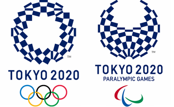
Could the clever designs also hold an undisclosed message?
After all the controversy that was caused by the possibly plagiarized logos that were originally intended to be the emblems of the 2020 games, the recently announced new official designs haven’t run into any problems so far. The winning logo features an assortment of quadrilaterals arranged in a circular shape that is titled “Harmonized Checkered Emblem”. This design pulls its inspiration from Japanese history as the checkered pattern called ichimatsu moyo came about in the Edo period (1603-1867). The particular shade of blue is also a traditional color, one that stands for elegance and sophistication. According to the designer, Asao Tokolo, the variety of rectangles is meant to represent different countries, cultures, and ways of thinking.
As nice as all of that sounds, the logos are actually a lot cooler than you might think. Thanks to a bit of analysis, it’s clear that the two logos, the one for the Tokyo Olympic Games and the one for the Tokyo Paralympic Games, can actually morph into each other just by moving some of the rectangles around.
エンブレム、うちの教授が分析しとった。大きな24角形とその対角線から出来る12角形。それぞれの長方形はその12角形の頂点をお結んだもの。だと。見つけ出すのに3時間かかったって。 pic.twitter.com/K5RMV5vSlS
— ibuki (@ibuki7) April 26, 2016
枚数が同じどころじゃなかった。パーツごとの角度も変えないままオリンピックからパラリンピックにできる pic.twitter.com/TIv4IruvM8
— 鯵坂もっちょ🐟『つれづれなる数学日記』発売中 (@motcho_tw) April 26, 2016
Could it be that the message of “unity in diversity” in the Olympic games also extends to a unifying statement about the two events, how the athletes for the two games may be different, but that they both possess the same drive to become the best in their sport? As the two logos are made up of the exact same parts, but look a little different, so too do the athletes for both the Olympic and Paralympic games.
Even if that wasn’t the original intent of Tokolo, we can still hear the message loud and clear within his ingenious visual design. After the debacle of the original logos, these designs are definitely ones that we can get behind.
Sources: My Game News Flash, Tokyo 2020
Images: Tokyo 2020
Like this:
Like Loading…
- Japan
- (2020 Olympics • cool • official design • Olympics • paralympics • Tokyo Olympics)
Related Stories
 Could the 2020 Tokyo Olympics logo possibly be plagiarized?
 Looks like it’s time to say good-bye, and maybe good riddance, to the 2020 Tokyo Olympics logo
 Is there an adorably chubby bird hiding inside the Tokyo Olympics logo?
 The 2020 Tokyo Olympics announces the winner of its adorable mascot election
 Online auction market booming for posters with cancelled, possibly copied 2020 Olympics emblem
- Same-sex prostitution business technically legal in Japan, goes untouched by police
- New Suntory beer cans feature 15 different Shinkansen bullet trains and local landscapes
- Trackbacks (0)
Trackbacks
- There are no trackbacks yet.
- Trackback URL
Trending Today
- Pachinko parlor operator arrested for not obscuring the act of gambling well enough
- Starbucks Japan unveils new winter drinkware collection with limited-edition Stanley cups
- Get the taste of the U.K. in Tokyo with 99 Flakes, meat pies, and Jaffa Cakes
- Pokémon doughnuts pop up at Mister Donut, with a new gathering that’s bigger than ever
- First-ever cafe on Tokyo Imperial Palace Garden grounds is now open
- Japanese government hires leading comedy agency to explain national defense spending
- Liquid croissant coffee is coming to Japanese stores this month
- Discount retailers known for massive bargains releases massive Japanese egg sandwich
- Japan ends tax-free shopping system for foreign tourists, new refund request system now in effect
- Restaurant opens in Japan with all-dementia waitresses, serves up ramen, awareness, and kindness
- Same-sex prostitution business technically legal in Japan, goes untouched by police
- New Suntory beer cans feature 15 different Shinkansen bullet trains and local landscapes
-
Recent Posts
- Japan’s new matcha vending machines serve freshly prepared matcha in five different strengths
- Restaurant opens in Japan with all-dementia waitresses, serves up ramen, awareness, and kindness
- Get the taste of the U.K. in Tokyo with 99 Flakes, meat pies, and Jaffa Cakes
- Japanese government hires leading comedy agency to explain national defense spending
- Starbucks Japan unveils new winter drinkware collection with limited-edition Stanley cups
-
MOST POPULAR
- Today
- Weekly
- Monthly
- Yearly
Today
 Pachinko parlor operator arrested for not obscuring the act of gambling well enough
 Starbucks Japan unveils new winter drinkware collection with limited-edition Stanley cups
 Get the taste of the U.K. in Tokyo with 99 Flakes, meat pies, and Jaffa Cakes
 Pokémon doughnuts pop up at Mister Donut, with a new gathering that’s bigger than ever
 First-ever cafe on Tokyo Imperial Palace Garden grounds is now open
 Japanese government hires leading comedy agency to explain national defense spending
 Liquid croissant coffee is coming to Japanese stores this month
 Discount retailers known for massive bargains releases massive Japanese egg sandwich
 Japan ends tax-free shopping system for foreign tourists, new refund request system now in effect
 Restaurant opens in Japan with all-dementia waitresses, serves up ramen, awareness, and kindness
Weekly
- Japan ends tax-free shopping system for foreign tourists, new refund request system now in effect
 Japan’s TeamLab digital art group is opening a permanent museum in America
 Beautiful Ghibli diorama kits lets you build anime characters’ homes inside yours [Photos]
- Pachinko parlor operator arrested for not obscuring the act of gambling well enough
- Liquid croissant coffee is coming to Japanese stores this month
 Family Mart releases 47 convenience store socks and stickers, one for every prefecture in Japan
- Pokémon doughnuts pop up at Mister Donut, with a new gathering that’s bigger than ever
 Starbucks Japan releases now Tokyo Reserve Roastery Christmas drinkware collection [Photos]
- Starbucks Japan unveils new winter drinkware collection with limited-edition Stanley cups
 Japanese government announces criteria for creating backup capital of Japan
Monthly
 Pokémon Company announces first-ever permanent Pokémon store to open outside Asia
- Japan ends tax-free shopping system for foreign tourists, new refund request system now in effect
- Family Mart releases 47 convenience store socks and stickers, one for every prefecture in Japan
- Japan’s TeamLab digital art group is opening a permanent museum in America
 What’s it like to stay in a Japanese container hotel?
- Beautiful Ghibli diorama kits lets you build anime characters’ homes inside yours [Photos]
 Chainsaw robots helping keep trains running safely in east Japan [Video]
 New Studio Ghibli anime gets extended run at the only cinema in Japan where it’s being shown
 Osaka’s famous Glico Running Man will be removed and replaced with a new-look sign
 Studio Ghibli creates illustrated Kyoto sightseeing map, available at any 7-Eleven Japan store
Yearly
 Japan announces sudden 400-percent increase in visa fees for foreigners entering the country
 Japan’s human washing machines will go on sale to general public, demos to be held in Tokyo
 Studio Ghibli has a new anime out, and there’s only one place in the world where you can see it
 Starbucks Japan releases new drinkware and goods for Valentine’s Day
 Starbucks Japan releases new sakura goods and drinkware for cherry blossom season 2026
 Japan’s newest Shinkansen has no seats…or passengers [Video]
 Tokyo subway installing new ticket gates that don’t accept payment through Suica or other IC cards
 Japanese ninja certification exam attracts 131 candidates from Japan and abroad
 Salomon releases Japan-exclusive Mt. Fuji hiking gear that doubles as an amazing souvenir
 Japan reportedly adding Japanese language skill requirement to most common foreigner work visa
-
RECOMMENDED STORIES
 Just what the heck is the Tokyo Olympics symbol supposed to be?
 Tokyo Olympics and Paralympics mascot finalists unveiled【Pics & Video】
 Tokyo Olympics opening ceremony preliminary ticket prices announced, wallets cry across Japan
 McDonald’s Japan gets into the spirit of the games with new Tokyo 2020 Olympics tumblers
 Tokyo Olympic committee comes up with clever way to let blind children help select Games’ mascots
 Tokyo Olympics is looking for volunteers, may have a hard time finding them
- Tokyo Olympics loses first participant as Canada withdraws from Games over coronavirus concerns
 Net user proposes clever changes to 2020 Tokyo Olympics logo in light of one-year delay
 2020 Tokyo Olympic torch relay to tour all 47 prefectures of Japan starting from Fukushima
 Tokyo Olympics organizers offer to pay volunteers 125 yen 【US$1.13】 an hour, critics unimpressed
 Team behind Paralympic opening ceremony kept secret for fear of past scandals coming to light
 2020 Summer Olympics in Tokyo will Blow. You. Away.
 Olympic committee expands call for logo design submissions, children and office workers welcome
 Georgian Paralympic judo athlete arrested for attacking a security guard in a Tokyo hotel
 Advice for Tokyo 2020 Olympics volunteers: Dress like a Japanese ninja
-
-
Categories
Categories Select Category Africa (33) Anime & Manga (193) Art (64) Australia (42) C America (9) C Asia (17) Canada (59) Cats (72) China (847) Culture (180) Cute (187) Entertainment (248) Europe (345) FN24 (1) Food & Drink (314) Games & Tech (167) Global (1,073) India (11) Internet (2,198) Italy (13) Japan (34,562) Korea (375) Lifestyle (76) Mexico (6) Music (12) N Asia (4) New Zealand (11) News (61) North Korea (72) Oceania (10) Russia (56) S America (33) S Asia (66) SE Asia (378) Space (2) Taiwan (203) UK (18) Uncategorized (19) USA (978) W Asia (25)
-
Archives
Archives Select Month November 2026 (31) October 2026 (144) September 2026 (156) August 2026 (174) July 2026 (197) June 2026 (174) May 2026 (138) April 2026 (142) March 2026 (150) February 2026 (124) January 2026 (138) December 2025 (136) November 2025 (136) October 2025 (151) September 2025 (154) August 2025 (143) July 2025 (158) June 2025 (165) May 2025 (162) April 2025 (181) March 2025 (157) February 2025 (127) January 2025 (139) December 2024 (148) November 2024 (149) October 2024 (153) September 2024 (154) August 2024 (158) July 2024 (156) June 2024 (150) May 2024 (166) April 2024 (150) March 2024 (157) February 2024 (169) January 2024 (159) December 2023 (165) November 2023 (166) October 2023 (166) September 2023 (173) August 2023 (183) July 2023 (171) June 2023 (180) May 2023 (158) April 2023 (152) March 2023 (167) February 2023 (160) January 2023 (171) December 2022 (175) November 2022 (176) October 2022 (179) September 2022 (191) August 2022 (202) July 2022 (193) June 2022 (178) May 2022 (178) April 2022 (181) March 2022 (212) February 2022 (199) January 2022 (224) December 2021 (230) November 2021 (214) October 2021 (215) September 2021 (238) August 2021 (225) July 2021 (207) June 2021 (218) May 2021 (209) April 2021 (206) March 2021 (225) February 2021 (209) January 2021 (224) December 2020 (225) November 2020 (224) October 2020 (231) September 2020 (238) August 2020 (227) July 2020 (220) June 2020 (209) May 2020 (215) April 2020 (238) March 2020 (235) February 2020 (222) January 2020 (233) December 2019 (187) November 2019 (214) October 2019 (237) September 2019 (195) August 2019 (205) July 2019 (183) June 2019 (201) May 2019 (231) April 2019 (192) March 2019 (242) February 2019 (211) January 2019 (238) December 2018 (212) November 2018 (217) October 2018 (214) September 2018 (203) August 2018 (217) July 2018 (218) June 2018 (208) May 2018 (204) April 2018 (193) March 2018 (216) February 2018 (192) January 2018 (223) December 2017 (204) November 2017 (209) October 2017 (218) September 2017 (209) August 2017 (228) July 2017 (222) June 2017 (245) May 2017 (229) April 2017 (197) March 2017 (165) February 2017 (151) January 2017 (180) December 2016 (260) November 2016 (267) October 2016 (302) September 2016 (387) August 2016 (351) July 2016 (379) June 2016 (379) May 2016 (312) April 2016 (347) March 2016 (414) February 2016 (379) January 2016 (359) December 2015 (359) November 2015 (378) October 2015 (435) September 2015 (419) August 2015 (152) July 2015 (218) June 2015 (179) May 2015 (237) April 2015 (223) March 2015 (119) February 2015 (121) January 2015 (394) December 2014 (376) November 2014 (376) October 2014 (414) September 2014 (349) August 2014 (379) July 2014 (316) June 2014 (375) May 2014 (384) April 2014 (354) March 2014 (318) February 2014 (284) January 2014 (270) December 2013 (224) November 2013 (242) October 2013 (244) September 2013 (226) August 2013 (241) July 2013 (214) June 2013 (222) May 2013 (191) April 2013 (173) March 2013 (149) February 2013 (85) January 2013 (106) December 2012 (111) November 2012 (149) October 2012 (151) September 2012 (118) August 2012 (99) July 2012 (56) June 2012 (57) May 2012 (54) April 2012 (62) March 2012 (40) February 2012 (27) January 2012 (24) December 2011 (18) November 2011 (12) October 2011 (1) September 2011 (9) August 2011 (11) March 2011 (1)
-
- About Us | Jobs | Contact | Contribution | Partner with Us
© SoraNews24 —Japan News— / SOCIO CORPORATION
- Advertise |
- About Us |
- Work with us |
- Contact |
- Contribution |

%d