SoraNews24 —Japan News—
Bringing you yesterday's news from Japan and Asia, today.
Featured
- Weird
- Studio Ghibli
- Jobs
logo
Net user proposes clever changes to 2020 Tokyo Olympics logo in light of one-year delay
- Krista Rogers
Mar 31, 2020 - Tweet
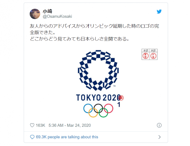
We’d like to add our own stamp of approval to the ones already there.
Read More
Shibuya 109 building unveils new winning logo design set to appear over scramble crossing in 2019
- Oona McGee
Jul 24, 2018
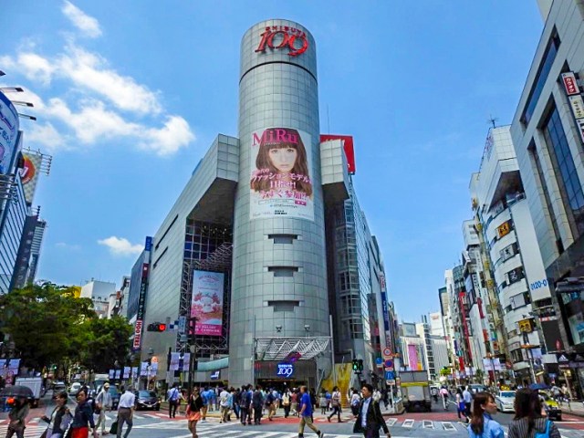
Owners say sayonara to their iconic red sign with a new logo that captures the spirit of all the youth fashion stores inside the building.
- Japan
- (art • competitions • design • fashion • logo • Shibuya • shibuya 109 • Shibuya scramble crossing • Tokyo)
Governor of Tokyo unveils new city logo, internet responds with questions about plagiarism again
- Oona McGee
Oct 14, 2015
Tokyo Governor Yoichi Masuzoe revealed the capital city’s new logo at a press conference in the nation’s capital on Friday, and the simple design, featuring the one-line catchphrase “&TOKYO”, is already in the spotlight for all the wrong reasons.
The logo unveiling was met with a heightened level of scrutiny following the plagiarism scandal which resulted in the withdrawal of the official Tokyo 2020 Olympics logo recently, and it turns out that netizens are now worried about a recurrence of events. The distinctive white ampersand enclosed in a circle has been discovered online in a similar black, white and red configuration currently in use by another organisation, an insurance and commercial litigation company in New Zealand.
- Japan
- (design • logo • Masuzoe • Olympics • Tokyo • Tokyo Governor • tourism • Yayoi Kusama)
Looks like it’s time to say good-bye, and maybe good riddance, to the 2020 Tokyo Olympics logo
- Casey Baseel
Sep 1, 2015
There hasn’t been a lot of love for the 2020 Tokyo Olympics’ logo, which was officially unveiled by the event’s Organising Committee at the tail-end of July. Almost immediately after getting their first eyeful of it, many in Japan called it unappealing and confusing, and just a few days later some were calling it plagiarized.
In other words, not too many people were looking forward to seeing the emblem plastered all over the city during the Games, as well as the years leading up to them. The good news for the logo’s detractors is that they probably won’t have to, as the organizers of the Tokyo Olympics seem ready to officially withdraw the design for their promotion.
- Japan
- (2020 Olympics • design • logo • Olympics • plagiarism • scandal • Tokyo Olympics)
Is there an adorably chubby bird hiding inside the Tokyo Olympics logo?
- Casey Baseel
Aug 1, 2015
It’s been a rocky debut for the 2020 Tokyo Olympics official logo. First, it elicited mixed reactions as to whether its somewhat obtuse aesthetics really conveyed the noble sentiments it was aiming for. Then came the allegations that the logo was plagiarized from the emblem of a Belgian theater.
But let’s set aside the issue of whether or not the design is a copy or not and ask another artistic question: Is the Tokyo Olympics logo actually an adorably stylized bird?
- Japan
- (2020 Olympics • cute • design • funny • logo • Olyumpis • Tokyo Olympics)
Design agency reimagines Pokémon as corporate logos
- Anime News Network
Jan 27, 2015
San Francisco design agency Pictogram has reimagined several Pokemon as corporate logos, joking that “since the Pokémon Corporate Personhood Act of 2015, as spearheaded by Professor OAK, Pokémon became free to start their own companies, mandating the design of Pokémon brand identities.”
Here are some of our favorites:
- Global
- (Anime News Network • brand • design • logo)
The konami code makes Twitter flip the bird!
- Fran W
Jun 24, 2014
It’s the ultimate easter egg, the key to secret funny effects on all kinds of websites. The konami code, entered by pressing the sequence up-up-down-down-left-right-left-right-B-A, works on Twitter!
The code, which originated in video games from Japanese publisher Konami, and is called the konami komando (“konami command”) in Japanese. Twitter user @konosuke recently posted that, perusing the site’s JavaScript, he had discovered a piece of code in there that read “konami_watcher”. Intrigued, he punched in the magic code on Twitter’s timeline page and … something surprising happened! Join us after the jump for a look at Twitter’s new flippy bird!
- Internet
- (cheat • easter eggs • konami code • logo • twitter)
North Korea releases new logo for space agency, Internet forgets how acronyms work
- Preston Phro
Apr 3, 2014
For a country that allegedly has little contact with the outside world, North Korea somehow manages to end up in the news an awful lot. While it’s hard to tell how much of what we hear and read is true, sometimes a nugget of truth–beautiful, hilarious truth–slips through the cracks of propaganda on both sides of the ideological line and leaves us giggling.
As you’ve probably heard, the Democratic People’s Republic of Korea (DPRK) has recently unveiled the logo for their year-old space agency, NADA. Though they may have expected fanfare or at least a bit of grudging respect, the main response they got was an Internet full of giggles.
- Internet, North Korea
- (logo • NADA • NASA • North Korea • space)
Pop artist makes familiar logos even better with Ghibli characters and more
- Michelle Lynn Dinh
Feb 18, 2014
Today the marketing industry is a multi-billion dollar entity that spends countless man-hours designing and maintaining relatable brand logos. That’s why the work of pop-culture artist, Bruce Yan, is so cool. He takes characters we all know and love and uses them to recreate logos we see every day, somehow managing to give rise to a brand new and yet completely familiar logo. From the Girl Scout symbol to Morton Salt, take a look at his clever redesigns after the jump!
-
Recent Posts
- Get the taste of the U.K. in Tokyo with 99 Flakes, meat pies, and Jaffa Cakes
- Japanese government hires leading comedy agency to explain national defense spending
- Starbucks Japan unveils new winter drinkware collection with limited-edition Stanley cups
- Pokémon doughnuts pop up at Mister Donut, with a new gathering that’s bigger than ever
- Discount retailers known for massive bargains releases massive Japanese egg sandwich
-
MOST POPULAR
- Today
- Weekly
- Monthly
- Yearly
Today
 Pachinko parlor operator arrested for not obscuring the act of gambling well enough
 Starbucks Japan unveils new winter drinkware collection with limited-edition Stanley cups
 Pokémon doughnuts pop up at Mister Donut, with a new gathering that’s bigger than ever
 Japan ends tax-free shopping system for foreign tourists, new refund request system now in effect
 Discount retailers known for massive bargains releases massive Japanese egg sandwich
 First-ever cafe on Tokyo Imperial Palace Garden grounds is now open
 Japanese government hires leading comedy agency to explain national defense spending
 Liquid croissant coffee is coming to Japanese stores this month
 Starbucks Japan reveals this year’s lucky bag, but you’ll have to act fast to get one
 Tokyo to build new crematoriums to meet surging demand
Weekly
- Japan ends tax-free shopping system for foreign tourists, new refund request system now in effect
 Japan’s TeamLab digital art group is opening a permanent museum in America
 Beautiful Ghibli diorama kits lets you build anime characters’ homes inside yours [Photos]
 Life-size Monster Hunter dragon statues to be built at Japanese shopping mall
 Evangelion announces collaboration with Hard Rock Cafe
 Cold Stone is closing its final branch in all of east Japan, but it’s going down singing
- Liquid croissant coffee is coming to Japanese stores this month
 Studio Ghibli homeware brand’s faux oil lamp brings light, smiles, and Kiki’s Jiji to your home
 Family Mart releases 47 convenience store socks and stickers, one for every prefecture in Japan
 Starbucks Japan releases now Tokyo Reserve Roastery Christmas drinkware collection [Photos]
Monthly
 Pokémon Company announces first-ever permanent Pokémon store to open outside Asia
- Japan ends tax-free shopping system for foreign tourists, new refund request system now in effect
- Family Mart releases 47 convenience store socks and stickers, one for every prefecture in Japan
- Japan’s TeamLab digital art group is opening a permanent museum in America
 What’s it like to stay in a Japanese container hotel?
- Beautiful Ghibli diorama kits lets you build anime characters’ homes inside yours [Photos]
 Chainsaw robots helping keep trains running safely in east Japan [Video]
 New Studio Ghibli anime gets extended run at the only cinema in Japan where it’s being shown
 Tokyo train station will play Godzilla theme song as new departure melody
 Osaka’s famous Glico Running Man will be removed and replaced with a new-look sign
Yearly
 Japan announces sudden 400-percent increase in visa fees for foreigners entering the country
 Japan’s human washing machines will go on sale to general public, demos to be held in Tokyo
 Studio Ghibli has a new anime out, and there’s only one place in the world where you can see it
 Starbucks Japan releases new drinkware and goods for Valentine’s Day
 Starbucks Japan releases new sakura goods and drinkware for cherry blossom season 2026
 Japan’s newest Shinkansen has no seats…or passengers [Video]
 Tokyo subway installing new ticket gates that don’t accept payment through Suica or other IC cards
 Japanese ninja certification exam attracts 131 candidates from Japan and abroad
 Salomon releases Japan-exclusive Mt. Fuji hiking gear that doubles as an amazing souvenir
 Japan reportedly adding Japanese language skill requirement to most common foreigner work visa
-
RECOMMENDED STORIES
 First-ever cafe on Tokyo Imperial Palace Garden grounds is now open
 Japanese government hires leading comedy agency to explain national defense spending
 Liquid croissant coffee is coming to Japanese stores this month
 Starbucks Japan reveals this year’s lucky bag, but you’ll have to act fast to get one
 Tokyo to build new crematoriums to meet surging demand
 Family Mart releases 47 convenience store socks and stickers, one for every prefecture in Japan
 Continuing cyberattacks hit Japanese arcade hard [Photos]
 Beautiful Ghibli diorama kits lets you build anime characters’ homes inside yours [Photos]
 Japan’s free stock image site of muscular men doing whimsical and mundane things reveals rankings
 Get the taste of the U.K. in Tokyo with 99 Flakes, meat pies, and Jaffa Cakes
 Princess Mononoke was going to look totally different, new Studio Ghibli artbook shows
 Mr. Sato searches for the mysterious new wall of fortune in Tokyo
 Japan’s TeamLab digital art group is opening a permanent museum in America
 Starbucks Japan releases now Tokyo Reserve Roastery Christmas drinkware collection [Photos]
-
-
Categories
Categories Select Category Africa (33) Anime & Manga (193) Art (64) Australia (42) C America (9) C Asia (17) Canada (59) Cats (72) China (847) Culture (180) Cute (187) Entertainment (248) Europe (345) FN24 (1) Food & Drink (314) Games & Tech (167) Global (1,073) India (11) Internet (2,198) Italy (13) Japan (34,560) Korea (375) Lifestyle (76) Mexico (6) Music (12) N Asia (4) New Zealand (11) News (61) North Korea (72) Oceania (10) Russia (56) S America (33) S Asia (66) SE Asia (378) Space (2) Taiwan (203) UK (18) Uncategorized (19) USA (978) W Asia (25)
-
Archives
Archives Select Month November 2026 (29) October 2026 (144) September 2026 (156) August 2026 (174) July 2026 (197) June 2026 (174) May 2026 (138) April 2026 (142) March 2026 (150) February 2026 (124) January 2026 (138) December 2025 (136) November 2025 (136) October 2025 (151) September 2025 (154) August 2025 (143) July 2025 (158) June 2025 (165) May 2025 (162) April 2025 (181) March 2025 (157) February 2025 (127) January 2025 (139) December 2024 (148) November 2024 (149) October 2024 (153) September 2024 (154) August 2024 (158) July 2024 (156) June 2024 (150) May 2024 (166) April 2024 (150) March 2024 (157) February 2024 (169) January 2024 (159) December 2023 (165) November 2023 (166) October 2023 (166) September 2023 (173) August 2023 (183) July 2023 (171) June 2023 (180) May 2023 (158) April 2023 (152) March 2023 (167) February 2023 (160) January 2023 (171) December 2022 (175) November 2022 (176) October 2022 (179) September 2022 (191) August 2022 (202) July 2022 (193) June 2022 (178) May 2022 (178) April 2022 (181) March 2022 (212) February 2022 (199) January 2022 (224) December 2021 (230) November 2021 (214) October 2021 (215) September 2021 (238) August 2021 (225) July 2021 (207) June 2021 (218) May 2021 (209) April 2021 (206) March 2021 (225) February 2021 (209) January 2021 (224) December 2020 (225) November 2020 (224) October 2020 (231) September 2020 (238) August 2020 (227) July 2020 (220) June 2020 (209) May 2020 (215) April 2020 (238) March 2020 (235) February 2020 (222) January 2020 (233) December 2019 (187) November 2019 (214) October 2019 (237) September 2019 (195) August 2019 (205) July 2019 (183) June 2019 (201) May 2019 (231) April 2019 (192) March 2019 (242) February 2019 (211) January 2019 (238) December 2018 (212) November 2018 (217) October 2018 (214) September 2018 (203) August 2018 (217) July 2018 (218) June 2018 (208) May 2018 (204) April 2018 (193) March 2018 (216) February 2018 (192) January 2018 (223) December 2017 (204) November 2017 (209) October 2017 (218) September 2017 (209) August 2017 (228) July 2017 (222) June 2017 (245) May 2017 (229) April 2017 (197) March 2017 (165) February 2017 (151) January 2017 (180) December 2016 (260) November 2016 (267) October 2016 (302) September 2016 (387) August 2016 (351) July 2016 (379) June 2016 (379) May 2016 (312) April 2016 (347) March 2016 (414) February 2016 (379) January 2016 (359) December 2015 (359) November 2015 (378) October 2015 (435) September 2015 (419) August 2015 (152) July 2015 (218) June 2015 (179) May 2015 (237) April 2015 (223) March 2015 (119) February 2015 (121) January 2015 (394) December 2014 (376) November 2014 (376) October 2014 (414) September 2014 (349) August 2014 (379) July 2014 (316) June 2014 (375) May 2014 (384) April 2014 (354) March 2014 (318) February 2014 (284) January 2014 (270) December 2013 (224) November 2013 (242) October 2013 (244) September 2013 (226) August 2013 (241) July 2013 (214) June 2013 (222) May 2013 (191) April 2013 (173) March 2013 (149) February 2013 (85) January 2013 (106) December 2012 (111) November 2012 (149) October 2012 (151) September 2012 (118) August 2012 (99) July 2012 (56) June 2012 (57) May 2012 (54) April 2012 (62) March 2012 (40) February 2012 (27) January 2012 (24) December 2011 (18) November 2011 (12) October 2011 (1) September 2011 (9) August 2011 (11) March 2011 (1)
-
- About Us | Jobs | Contact | Contribution | Partner with Us
© SoraNews24 —Japan News— / SOCIO CORPORATION
- Advertise |
- About Us |
- Work with us |
- Contact |
- Contribution |
